The Importance of Responsive Web Design for Business Growth
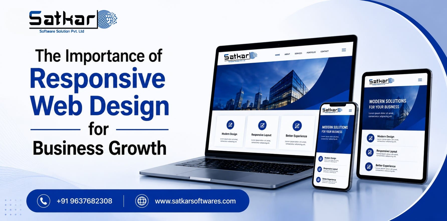
Responsive web design is no longer an optional feature—it is the foundation of a successful digital presence. Modern users access websites from smartphones, tablets, laptops, desktops, smart TVs, and even wearable devices. A responsive website automatically adapts to every screen size, delivering a consistent, fast, and user-friendly experience. Businesses that invest in responsive web design benefit from improved SEO rankings, better user engagement, increased conversions, stronger brand credibility, and enhanced visibility across AI-powered search platforms such as Google AI Overviews, ChatGPT Search, Gemini, and Perplexity.
Why is responsive web design important?
Responsive web design ensures your website automatically adjusts to different screen sizes and devices, providing an excellent user experience. It improves search engine rankings, reduces bounce rates, increases conversions, enhances accessibility, and supports Google's mobile-first indexing. A responsive website also improves visibility in AI-powered search platforms and creates a seamless experience for visitors regardless of the device they use.
- Responsive web design improves SEO rankings.
- Mobile-friendly websites generate higher conversions.
- Google prioritizes responsive websites through mobile-first indexing.
- Faster websites improve customer satisfaction.
- Responsive websites reduce maintenance costs.
- Consistent user experience strengthens brand credibility.
- AI-powered search engines prefer structured, user-friendly websites.
- Responsive design supports accessibility and inclusivity.
- Core Web Vitals directly influence search visibility.
- Investing in responsive web design helps future-proof your business.
The Importance of Responsive Web Design for Business Growth
Imagine discovering a business online while commuting, browsing on your smartphone during lunch, or researching products on your tablet at home. You click a promising website expecting a smooth experience—but instead, the text is difficult to read, images overlap, buttons are too small to tap, and navigation becomes frustrating. Within seconds, you leave and visit a competitor's website.
Poor mobile experiences remain one of the leading causes of website abandonment, making responsive design essential for retaining visitors.
Today's customers expect websites to work perfectly on every device. Whether they browse from smartphones, tablets, laptops, desktops, foldable devices, or smart TVs, they expect speed, clarity, and effortless navigation.
Responsive web design makes this possible. Rather than creating separate websites for desktop and mobile users, responsive design automatically adapts layouts, images, typography, and interactive elements according to the visitor's screen size and device.
In our experience designing responsive websites for manufacturing companies, healthcare providers, educational institutes, and SMEs, one consistent pattern has emerged: businesses that prioritize mobile usability often see higher engagement, improved lead quality, and lower bounce rates. While results vary by industry, responsive design has become a foundational element of long-term digital success.
As Google's algorithms continue evolving toward user-first experiences and AI-powered search becomes more influential, responsive web design has become a critical business investment rather than simply a design preference.
What is Responsive Web Design?
Responsive Web Design (RWD) is a web development approach that enables a website to automatically adapt its layout, content, images, and functionality according to the visitor's screen size and device.
Instead of creating multiple versions of the same website, responsive design uses:
- Flexible layouts
- Fluid grids
- Responsive images
- CSS media queries
- Adaptive typography
- Device-independent navigation
This creates a seamless browsing experience regardless of whether users access your website from smartphones, tablets, laptops, desktop computers, smart TVs, foldable devices, or future digital platforms.
Why Responsive Web Design Matters More Than Ever
Digital behavior has changed dramatically over the past few years. Customers no longer use a single device during their buying journey.
A typical customer might:
- Discover your business through Google on a smartphone.
- Read your blog on a tablet.
- Compare products on a laptop.
- Complete the purchase on a desktop.
- Contact your support team through mobile.
Every interaction shapes your brand perception. If your website fails on even one device, you risk losing potential customers. Responsive web design ensures every touchpoint delivers a smooth, professional experience that encourages engagement and builds trust.
Mobile Usage Continues to Dominate Internet Traffic
Mobile devices now account for the majority of global website traffic, making mobile optimization essential for business success.
Modern users expect websites to:
- Load quickly
- Display properly
- Provide easy navigation
- Offer tap-friendly buttons
- Present readable content without zooming
A responsive website meets these expectations by automatically optimizing layouts for smaller screens.
Businesses that ignore mobile usability often experience:
- Higher bounce rates
- Lower search rankings
- Reduced conversions
- Poor customer satisfaction
- Lost revenue opportunities
Google's Mobile-First Indexing Makes Responsive Design Essential
Google now primarily evaluates the mobile version of your website when determining search rankings. This approach, known as mobile-first indexing, means that a poorly optimized mobile experience can negatively affect your visibility even for desktop users.
Responsive websites help businesses:
- Improve crawlability
- Enhance indexing
- Increase keyword rankings
- Improve Core Web Vitals
- Reduce duplicate content
- Strengthen overall SEO performance
Responsive Design Creates Better User Experiences
Visitors judge a business within seconds of landing on its website. A responsive website creates positive first impressions through clean layouts, fast loading pages, consistent branding, intuitive navigation, easy-to-read typography, optimized images, and accessible interactive elements.
Businesses with superior user experiences often achieve:
- Higher engagement
- Increased customer trust
- Better lead quality
- Stronger conversion rates
- Improved customer retention
How Responsive Web Design Drives Long-Term Business Success
Responsive web design is much more than adjusting a website to fit different screen sizes. It directly impacts customer satisfaction, search engine rankings, brand credibility, conversion rates, and long-term business growth.
Responsive Web Design Improves SEO Performance
Search engines prioritize websites that provide an excellent user experience. Google's ranking systems increasingly evaluate websites based on usability, mobile friendliness, loading speed, page experience, and overall content accessibility.
A responsive website supports SEO by:
- Eliminating duplicate desktop and mobile websites
- Improving crawlability and indexing
- Supporting Google's mobile-first indexing
- Reducing bounce rates
- Increasing average session duration
- Enhancing Core Web Vitals
- Improving page speed
- Strengthening internal linking
Better User Experience Leads to Higher Conversions
Every visitor who lands on your website has a purpose—whether it's finding information, comparing products, requesting a quotation, or making a purchase. Responsive design removes unnecessary friction by ensuring users can complete these tasks easily.
A responsive website offers:
- Easy navigation
- Clear typography
- Touch-friendly buttons
- Optimized forms
- Fast page loading
- Consistent layouts
- Readable content
- Seamless checkout experiences
Core Web Vitals and Responsive Design
Google's Core Web Vitals remain one of the most important technical SEO ranking signals. Responsive websites are better positioned to meet these performance metrics:
| Core Web Vital | Why It Matters |
|---|---|
| Largest Contentful Paint (LCP) | Faster loading improves user satisfaction. |
| Interaction to Next Paint (INP) | Responsive interfaces improve responsiveness. |
| Cumulative Layout Shift (CLS) | Stable layouts reduce accidental clicks and frustration. |
Optimizing responsive layouts alongside Core Web Vitals improves both search rankings and customer experience.
Responsive Design Supports Accessibility
An effective website should be usable by everyone. Responsive design naturally supports accessibility by providing flexible text sizes, scalable layouts, improved readability, better navigation, keyboard accessibility, consistent interactions, and improved screen reader compatibility.
- Over the years, Satkar Software Solution Pvt. Ltd. has worked with businesses across manufacturing, healthcare, education, industrial sectors, startups, and professional service industries.
- One consistent observation is that responsive websites consistently outperform outdated websites in terms of organic search visibility, user engagement, mobile traffic, lead generation, customer satisfaction, and conversion rates.
- Businesses investing in responsive design generally experience improved digital performance because users can access information easily regardless of device.
- As Google's ranking systems continue prioritizing user experience and AI-powered search becomes increasingly important, responsive web design has become one of the strongest foundations for sustainable online growth.
The Impact of Responsive Design Across Industries
Our experience shows that businesses with responsive websites often achieve better mobile engagement, improved search rankings, lower bounce rates, increased average session duration, higher enquiry quality, and stronger customer trust.
Customers rarely distinguish between website design and business quality. Instead, they associate poor website experiences with poor business experiences. This makes responsive design one of the most important investments a company can make.
Industry Applications of Responsive Web Design
Manufacturing
Product specs, technical documentation, application guides, CAD drawings
Healthcare
Medical services, doctor profiles, appointment booking, patient education
Education
Admission enquiries, course exploration, event registrations, student engagement
SMEs & Startups
Professional presentation, better customer experience, improved search rankings
Manufacturing Industry Transformation
One of our manufacturing clients wanted to improve online enquiries while reducing bounce rates from mobile visitors. Our team implemented a comprehensive responsive redesign that included mobile-first layouts, faster loading pages, improved navigation, better product presentation, optimized enquiry forms, and technical SEO enhancements.
The redesigned website significantly improved usability across all devices and strengthened customer engagement throughout the buying journey.
Before & After Responsive Website Optimization
Before
- Desktop-focused layout
- Slow page loading
- Difficult mobile navigation
- Lower enquiry conversions
- Poor mobile experience
- Higher bounce rates
- Limited accessibility
After
- Mobile-first responsive design
- Faster loading pages
- User-friendly navigation
- Improved lead generation
- Excellent cross-device experience
- Better user engagement
- Improved accessibility
Research & Industry Statistics
According to Google's Search documentation, responsive web design simplifies crawling and indexing while supporting mobile-first indexing. HubSpot research also shows that improving website user experience can contribute to better engagement and lead generation.
How Responsive Design Supports AI-Powered Search
AI-powered search platforms evaluate both content quality and overall website experience. Fast loading pages, structured headings, schema markup, mobile usability, and clear answers make it easier for AI systems to understand and reference your content.
Platforms including Google AI Overviews, ChatGPT Search, Gemini, Perplexity, and Microsoft Copilot prefer websites that provide fast loading, structured content, mobile usability, clear navigation, helpful information, excellent user experience, strong technical SEO, and schema markup. Responsive web design strengthens every one of these ranking signals.
Why is responsive web design important?
Responsive web design ensures your website automatically adjusts to different screen sizes and devices, providing an excellent user experience. It improves search engine rankings, reduces bounce rates, increases conversions, enhances accessibility, and supports Google's mobile-first indexing.
- Responsive web design is essential for modern SEO.
- Mobile-first experiences improve customer satisfaction.
- Responsive websites support Google's mobile-first indexing.
- Better user experiences increase conversions.
- Responsive design strengthens accessibility.
- Faster websites improve engagement.
- Core Web Vitals directly influence rankings.
- AI-powered search engines prefer user-friendly websites.
- Responsive websites reduce long-term maintenance costs.
- Businesses investing in responsive design are better prepared for future technologies.
Ready to Build a Responsive Website That Drives Growth?
Our expert team at Satkar Softwares has helped 1,500+ businesses across India and globally build responsive, SEO-friendly, AI-ready websites that generate real results.
Frequently Asked Questions About Responsive Web Design
Start Building Your Responsive Website Today
Responsive web design is no longer optional for businesses that want to remain competitive. It supports better user experiences, stronger SEO performance, improved accessibility, and greater visibility across traditional and AI-powered search engines. As customer expectations continue to evolve, businesses that invest in responsive, fast, and user-focused websites will be better positioned for sustainable digital growth. At Satkar Software Solution Pvt. Ltd., we help businesses build responsive, SEO-friendly, AI-ready digital experiences that drive measurable business growth. Let's build a website that not only looks great but also performs exceptionally across every device and every search platform.